15 WordPress Design Mistakes That Hurt User Experience
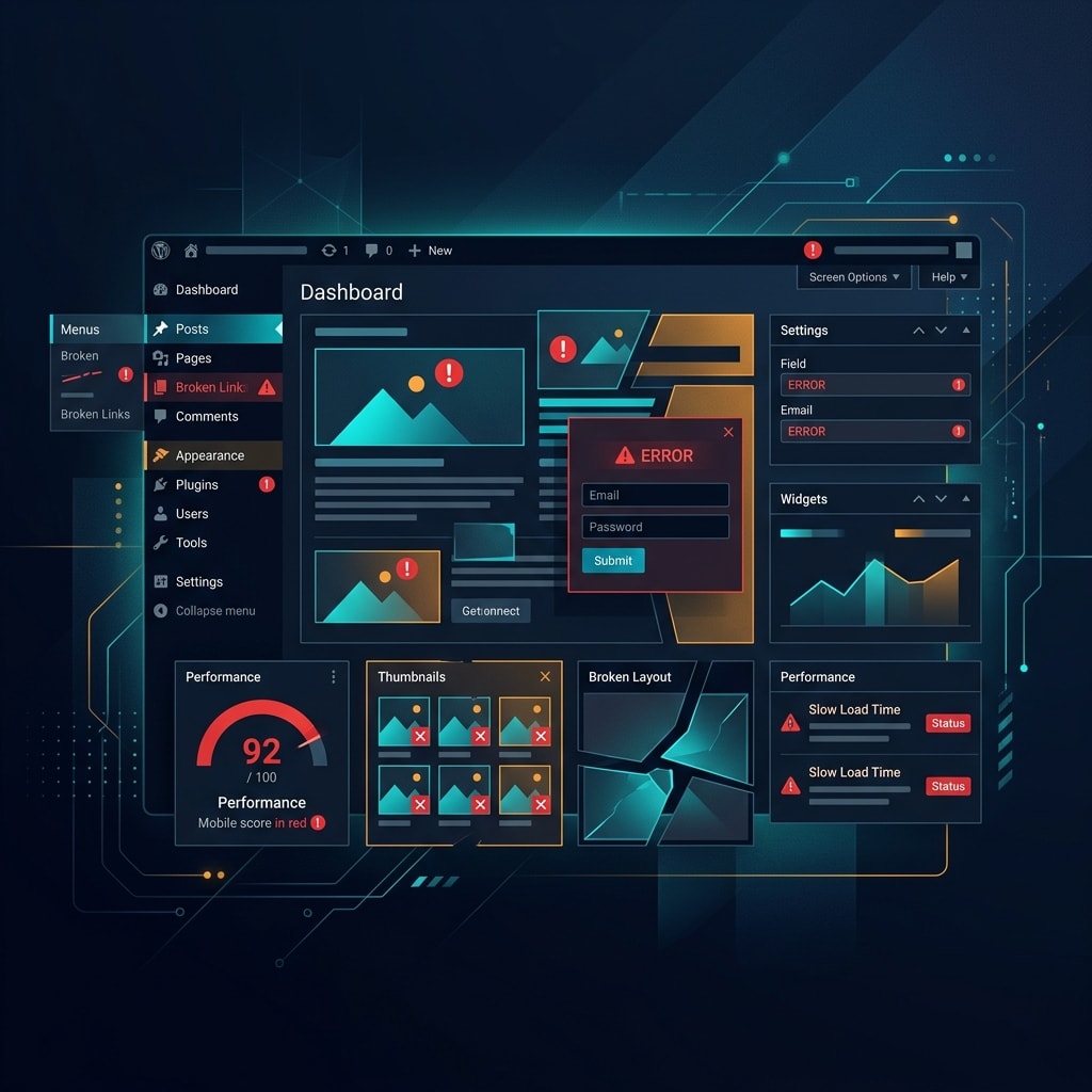
A business owner sits in a quiet office, watching live user recordings on Hotjar. A potential customer lands on their beautifully designed homepage, pauses for a moment, and then aggressively taps a button that fails to respond instantly. Frustrated by the silent lag, the user abandons the site within four seconds, leaving behind an empty cart and a damaged brand reputation. This digital tragedy happens across the United States every day because standard websites fail to respect the emotional and behavioral realities of modern users.
Many businesses mistakenly believe that an attractive layout equals a successful digital presence. When looking for an elite wordpress web design agency, sophisticated brands look beyond surface aesthetics to evaluate the underlying behavioral mechanics, technical performance frameworks, and semantic data structures that define the modern web. A website that looks stunning on a high-end desktop monitor but creates intense interaction friction on a mobile device will silently destroy a brand's conversion momentum and tank its rankings in AI-driven search environments.
Why Rigid Layouts Fail the Mobile Responsive Reality
How Rigid Grids Overload the Mobile User
Many custom WordPress themes rely on rigid desktop layouts that compress awkwardly on mobile devices. When layout elements fail to adapt dynamically, text overlapping occurs, form fields wrap into unclickable slivers, and tap targets melt together. This structural failure causes immediate cognitive overload, causing users to abandon the site out of sheer frustration.
What Responsive UX Systems Require
Modern mobile responsive architecture requires fluid layouts built on responsive typography and dynamic grid components. Touch targets must maintain a minimum surface area of 48 by 48 pixels with explicit spacing to prevent accidental clicks. Testing responsive layouts using absolute device breakpoints is an outdated practice; interfaces must flow smoothly across all viewport widths.
Why Slow Page Rendering Destroys User Trust
How Interaction Latency Ruins Conversion Rates
Speed is the baseline foundation of digital trust. If a WordPress page takes longer than two seconds to load, the user's emotional connection to the brand drops precipitously. The probability of an immediate bounce increases by over 30% as load times stretch from one to three seconds. Users view rendering lag as a clear sign of an unpolished, unreliable company.
What Triggers Severe Rendering Bottlenecks
Bloated, unoptimized page builder plugins loading unused CSS and JavaScript files.
Enormous uncompressed image assets that bypass modern image lazy loading protocols.
Excessive rendering delays caused by a complete lack of script deferral for non-essential tracking assets.
Subpar host environments that lack server-level caching mechanisms.
Why Ignoring Core Web Vitals Tanks Search Rankings
How Interaction to Next Paint Changes the Game
Google assesses user experience through real-world field data, using Core Web Vitals to measure visual stability, loading speed, and interaction responsiveness. The metric known as Interaction to Next Paint (INP) gauges the latency of every single user action across a session. When a user clicks a menu or opens an accordion tab, any feedback delay exceeding 200 milliseconds creates an immediate sense of system unresponsiveness.
| Phase | Description |
|---|---|
| User Action | The user clicks, taps, or presses a key. |
| Input Delay | The time between the user action and when the event handler begins to execute (often caused by main-thread blocking). |
| Processing Time | The time spent executing code within the event handlers. |
| Presentation Delay | The time it takes for the browser to recalculate layout, style, and paint the next frame to the screen. |
| Total INP Latency | The entire duration from the initial User Action to the final Frame Paint. |
What Technical Optimizations Are Necessary
To maintain strong visibility within organic search engine optimization services, websites must achieve pristine scores across all performance benchmarks. This requires aggressive code splitting, eliminating layout shifts by assigning clear dimension attributes to media assets, and achieving high performance ratings on performance testing tools like GTmetrix and Lighthouse.
Why Visually Cluttered Interfaces Cause Decision Fatigue
How Visual Overload Paralyzes the User
An interface crammed with competing elements, flashing promotional banners, autoplaying video backgrounds, and aggressive pop-ups will rapidly exhaust a visitor's working memory. When everything demands attention simultaneously, nothing stands out. This intense visual overload triggers instant decision fatigue, causing users to back out of the page to find an easier, cleaner browsing environment.
What Clear Visual Hierarchy Achieves
High Priority
Singular Hero Value Proposition
Generous Whitespace Padding
Secondary Priority
Contextual Explanatory Content
High Contrast Call to Action
A conversion-focused website design uses strategic whitespace to let crucial content breathe. By establishing an obvious information hierarchy, the layout naturally guides the viewer's eye from the core value proposition directly to the primary action area, removing friction from the user journey.
Why Confusing Navigation Schemes Alienate Visitors
How Hidden Menus Create Navigation Friction
When websites hide primary navigation options inside abstract icons or bury critical service pages under deep multi-tiered drop-downs, they introduce immense friction. Users expect intuitive, highly conversational website experiences where the path to information feels obvious. Forcing a user to guess where a page lives will lead to rapid abandonment.
What Logical Architecture Looks Like
An elite wordpress web development company builds clean, flat information structures where high-value conversion pages sit no more than two clicks away from the homepage. Drop-down menus must remain clear and predictable, using clear, descriptive text labels rather than industry jargon to guide users effortlessly through the conversion funnel.
Stop losing visitors to hidden UX friction
Get a Free UX AuditWhy Weak Color Contrast Breaks Digital Accessibility
How Poor Color Combinations Exclude Audiences
Using light gray text against a clean white background or layering white text over bright imagery might look trendy to an untrained designer, but it drastically harms the user experience. Millions of individuals navigating the web live with varying degrees of visual or cognitive impairments. Low color contrast makes scanning text exhausting and excludes a large portion of your potential audience.
| Contrast Ratio | WCAG Status | User Impact |
|---|---|---|
| Low Contrast #999999 on #FFFFFF | Fails | Illegible to many users, causing high cognitive load and visual strain. |
| High Contrast #222222 on #FFFFFF | Passes | Highly readable, accessible, and compliant for all users. |
What True Accessibility Optimization Demands
Website accessibility optimization means designing in alignment with current W3C Web Content Accessibility Guidelines (WCAG). Text elements must hit a strict minimum contrast ratio of 4.5:1 against their backgrounds. Ensuring full accessibility compliance broadens your audience reach while protecting your business from potential legal liabilities.
Why Missing Schema Markup Isolates AI Crawlers
How Traditional Content Fails Generative Engines
Search has evolved past simple keyword matching; it now functions on semantic understanding. When a WordPress site consists of unstructured text blocks without embedded semantic data, search crawlers struggle to connect entities properly. If AI agents cannot easily parse your site's core purpose, services, and locations, your brand will vanish from automated summaries and voice search results.
| Content Format | Processing Experience | AI Overview Outcome |
|---|---|---|
| Unstructured Content (Plain Paragraphs) | High Parsing Difficulty — Search crawlers must use heavy NLP to guess the context. | Dropped — Excluded from AI summaries due to low confidence scores. |
| Structured Content (JSON-LD Linked Data) | Instant Entity Recognition — Explicit machine-readable schema defines connections immediately. | Cited — Highly likely to be sourced and linked in AI Overviews. |
What Semantic SEO Systems Require
A sophisticated wordpress web development agency integrates deep schema markup frameworks directly into the custom codebase. Applying specific organization, product, local business, and FAQ schema transforms standard text into clean, machine-readable data structures that search bots and AI models can index with high confidence.
Why Generic Templates Destroy Brand Credibility
How Premade Themes Signal Lack of Authority
Using mass-market, pre-made WordPress templates downloaded by thousands of competing businesses makes your brand look entirely generic. These templates come packed with bloated, heavy feature sets designed to fit every possible industry, which severely bogs down frontend rendering performance. Furthermore, their highly repetitive layouts fail to build authentic credibility or set your brand apart in competitive markets.
Why Custom Website Architecture Wins
Investing in custom wordpress web development services gives you a highly tailored, light digital ecosystem crafted around your brand's specific goals. Custom development ensures clean semantic code structures, lightning-fast rendering speeds, and a completely unique visual identity that commands market authority and builds immediate buyer trust.
Why Aggressive Pop-ups Disrupt Conversion Momentum
How Intrusive Modules Intimidate Users
Few things break conversion momentum faster than a massive newsletter sign-up modal blocking the viewport the exact second a user lands on a page. Interrupting a user before they even read your headline creates instant negative sentiment. It breaks their concentration, feels highly intrusive, and drives visitors away before they can see your value.
| User Journey Start | UX Mechanism | User Sentiment | Business Outcome |
|---|---|---|---|
| User Lands on Site | Immediate Full-Screen Interstitial Pop-up | High Annoyance | Bounce (Lost Traffic) |
| User Reads Content | Scroll-Triggered, Low-Profile Inline CTA | High Engagement | Conversion (Acquisition) |
What High-Converting Interaction Patterns Look Like
Instead of using disruptive full-screen overlays, smart conversion systems place low-profile, contextual call-to-action blocks directly within the content flow. If you utilize exit-intent overlays, configure them to show only after a user has fully engaged with the content, ensuring your marketing interactions feel helpful rather than aggressive.
Why Flawed Form Designs Abandon Hot Leads
How Lengthy Forms Stifle Lead Generation
Every extra input field you add to a contact form increases conversion friction and user hesitation. Forcing a prospective customer to fill out dozens of fields, select from endless drop-downs, or crack complex anti-spam puzzles on a mobile screen will cause them to abandon the process halfway through.
| Form Strategy | User Flow / Fields Required | Friction Level | Conversion Impact |
|---|---|---|---|
| Legacy Form | Asks for Name, Email, Phone, Company, Budget, and Message all at once upfront. | High Friction | Low completion rates due to form fatigue and cognitive load. |
| Optimized Form | Asks only for Work Email initially, then routes the user through a smart, multi-step progression. | Low Friction | Maximizes initial engagement and lifts overall conversion rates. |
How to Build Frictionless Conversions
Keep forms short by requesting only essential contact data up front.
Incorporate real-time validation to catch errors instantly before submission.
Deploy multi-step form progressions that use clear, engaging micro-interactions.
Ensure input fields display appropriate keyboard layouts automatically on mobile devices.
Ready to eliminate design friction from your WordPress site?
Talk to Our WordPress ExpertsWhy Poor Typography Layouts Wear Out Readers
How Cramped Text Hinders Scanability
Typography defines how easily a visitor reads and absorbs your core messaging. When paragraphs use tiny font sizes, tight line spacing, or lines that span too wide across a screen, scanning content becomes physically tiring for the reader. If visitors hit a massive wall of text, they will skim past it entirely, missing your primary value propositions.
| Typography Profile | Font Size | Line Height | Line Length | Outcome |
|---|---|---|---|---|
| Cramped | 12px | 1.0 (Single) | ~120 Characters | Unreadable Wall: High eye strain, easy to lose your place. |
| Optimized | 18px | 1.6 (Fluid) | ~65 Characters | Perfect Scannability: Comfortable visual tracking, relaxed reading pace. |
What Elegant Type Systems Provide
Excellent readable typography uses a base font size of at least 16 to 18 pixels for body content, paired with a comfortable line height of 1.6. Keep line lengths restricted to a highly readable 45 to 75 characters per line. This maintains visual comfort, keeping readers engaged with your messaging for longer periods.
Why Static Layouts Fail to Engage Modern Audiences
How Static Frameworks Lose Consumer Attention
Modern users expect responsive, alive digital spaces that respond organically to their behavior. A static WordPress site lacking subtle visual feedback when interacting with buttons, links, or image elements feels completely flat and broken. This lack of interaction feedback leaves users uncertain whether their inputs were even registered by the browser.
How Micro Interactions Enhance the Journey
Integrating subtle UX micro interactions, smooth hover transitions, and gentle scrolling animations makes your digital experience feel premium and responsive. These minor visual cues confirm user actions, lower friction points, and build an enjoyable browsing experience that keeps users moving smoothly down your conversion pipeline.
Why Broken Media Assets Damage Authority
How Missing Content Signals Poor Quality
Encountering broken image placeholders, missing video blocks, or layout-shifting text containers instantly shatters user trust. It signals that a business neglects its online presence. If a brand fails to maintain its own website, consumers assume they will offer a similarly careless approach to customer support and product delivery.
| Initial State | Engineering Experience | Psychological / Brand Outcome |
|---|---|---|
| Missing Image Asset | Layout Shift (CLS Trigger) — Images load without explicit dimensions, causing elements to jump unexpectedly. | Damaged Brand Authority — Users experience high friction, accidental clicks, and a perceived lack of technical polish. |
| Optimized Media Shell | Stable Render Framework — Aspect-ratio boxes and placeholders reserve space before the image downloads. | Preserved Trust Architecture — A seamless, predictable reading experience that strengthens user confidence and retention. |
How to Protect Visual Quality
Regularly monitor your digital presence using behavioral analytics platforms and automated quality checkers. Always define exact width and height dimensions for all visual components within your codebase. This reserves the correct screen real estate during the initial load, preventing unexpected layout shifts and maintaining a clean visual layout.
Why Hidden Contact Elements Prevent Inquiries
How Confusing Layouts Stop Sales Inquiries
When a prospective B2B client or local consumer wants to book your services, they expect to locate your contact channels instantly. Forcing visitors to dig through footer links or hunt down an elusive contact page will kill their purchase intent, driving them straight to a competitor with a clearer setup.
How to Elevate Access to Inquiries
Position your primary contact options, business phone number, and clear call-to-action buttons prominently within your header layout. For businesses scaling cross-regional visibility, implementing comprehensive regional landing strategies via specialized generative engine optimization services ensures your target audience finds clear location data the moment they look for your brand.
Why Disconnected SEO and Design Frameworks Limit Growth
How Fragmented Strategies Hurt Visibility
Building a website layout purely for visual appeal while ignoring underlying search principles results in an invisible digital asset. When design frameworks operate independently from semantic content architecture, the resulting site often suffers from broken header sequences, slow loading times, and poor crawling clarity, keeping you off the first page of search results.
| Methodology | Structural Workflow | Final Business Outcome |
|---|---|---|
| Outdated Method | Visual Design Only → Technical Build | Bolted-on SEO (Low Visibility): Search optimization is treated as an afterthought, leading to structural indexing issues and low organic reach. |
| Modern Method | Integrated UX Systems + Semantic SEO Frameworks | Omnichannel Growth: Content accessibility, user experience, and crawlability are built together, resulting in compounding traffic and scalable conversions. |
Why Integrated Performance Systems Thrive
True digital growth happens when performance optimization, conversational interface design, and semantic structure are baked into your core design phase. Merging user psychology with clean technical execution allows businesses to capture broad informational and highly transactional searches at the exact same time, driving reliable revenue growth.
Build a website that ranks, converts, and scales
Partner with 10 NativeHow Competitors and Outdated Agencies Fall Short
To truly dominate your industry across major business hubs like New York, Los Angeles, Chicago, and Miami, you must understand where most traditional web agencies fall short.
| Outdated Agency Methodology | 10 Native Performance System |
|---|---|
| Deploys bloated premade templates with heavy codebases. | Engineers light, custom-built digital solutions. |
| Builds basic responsive setups that distort on mobile devices. | Optimizes for mobile-first user interaction design. |
| Ignore modern interaction metrics like INP entirely. | Prioritizes Core Web Vitals to maximize responsiveness. |
| Delivers disconnected SEO structures after design is final. | Crafts integrated semantic SEO architectures from day one. |
| Uses confusing navigation patterns that lose active leads. | Implements clear, conversion-driven information design. |
Moving Beyond Simple Templates to Elevate Your Brand
Relying on out-of-the-box templates severely limits your digital potential. True online authority requires professional wordpress web development services engineered to address complex buyer behaviors. While template setups offer a quick fix, they lack the foundational clean code required to rank effectively in modern, AI-driven search environments.
By opting for high-performance custom wordpress web development services, your business secures a fast, accessible, and uniquely styled asset built to scale alongside your evolving brand strategy.
Aligning Your Strategy for Modern Search Systems
Modern user journeys extend far beyond standard search boxes. Sophisticated organizations must now prepare for advanced AI-driven discovery paths. Incorporating custom AI Solutions allows you to leverage predictive user modeling, smart dynamic content delivery, and interactive conversational spaces that keep users highly engaged.
| Core Engine | Strategic Capability | Target Growth Outcome |
|---|---|---|
| Organic SEO | Search Engine Optimization Services | Dominating high-intent keyword spaces via Traditional Rankings. |
| GEO Framework | Generative Engine Optimization Services | Securing brand visibility and authority inside AI Overviews (LLMs). |
| Shopify Systems | Premium Web Design Services | Unlocking seamless infrastructure and E-commerce Channel Scalability. |
| Custom WordPress | Bespoke Technical Architecture | Building a fast, secure, and High-Conversion Corporate Hub. |
Integrating traditional visibility efforts with modern generative engine optimization services ensures your company's core insights are cleanly structured, easily retrievable, and frequently cited by major artificial intelligence discovery models.
Maximizing Growth Across Local and National Markets
Expanding your market reach requires a deep, strategic blueprint that balances local visibility with national scale. For brands looking to capture dominant positioning in primary economic hubs, leveraging our comprehensive roadmap, the Complete Guide To SEO Services For Local And National Growth In New York, provides the precise architectural framework needed to win highly competitive keywords.
Whether you are targeting regional search intent in Dallas, Seattle, San Francisco, or Austin, or deploying broad campaigns across Denver, Houston, Atlanta, and Nashville, combining clear user journeys with robust technical optimization ensures your brand maintains top visibility across every market you enter.
How 10 Native Redefines WordPress Design Architecture
As 10 Native, we approach digital architecture from a fundamentally different perspective. We recognize that your website isn't an online brochure; it is the core engine of your brand authority and conversion pipeline. We blend deep behavioral psychology with clear technical design to create digital experiences that perform beautifully across all devices.
Our specialist team eliminates the common technical friction points that slow down growth. By choosing to partner with a premier wordpress web design agency, you transition away from cluttered, slow layouts toward light, high-converting digital ecosystems built for long-term market leadership.
Frequently Asked Questions
Why are users leaving my WordPress website so quickly?
How do I improve user experience on my WordPress site?
Should I hire a wordpress web design agency or use a template?
What makes modern WordPress UX fail most often?
Why do custom WordPress solutions outperform standard templates?
How do slow loading speeds affect digital conversions?
Why does a clear visual hierarchy matter for conversion optimization?
How do AI-driven search models crawl and evaluate WordPress content?
Building an Enduring Foundation for Digital Growth
In the highly competitive digital landscape across the United States, your user experience dictates your business trajectory. A website built on cluttered layouts, slow loading performance, and weak data structures will naturally push prospects away, driving them directly to your competitors. Excellent design is no longer just an aesthetic choice; it is a critical requirement for market survival.
True digital success belongs to brands that treat user experience as a core business discipline. By combining intuitive, accessible layouts with fast rendering speeds and deep semantic structures, you build a powerful digital ecosystem that captures user attention and earns long-term brand authority. Let us transform your online presence into a clean, high-performing asset designed to grow your business for years to come.
Transform Your WordPress Experience